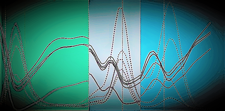
Image Description: I created several COVID-19 case plots for Toronto, London, and New York City, capturing changes in public movement using cellphone data and simultaneously plotting changes in covid cases. I took 3 of these plots, cut and spliced them together, applied several filters to get this saturated look and created an oval image in the background to give the feeling of a globe (as this is a global issue, and these 3 cities are globally renown cities).
Why did you conduct this research? To try and generate and provide as much evidence in the fight against COVID-19.
Technique: I used SAS to generate the original line plots, MS Photo app to crop and style the 3 images, and paint to splice them together.
Acknowledgements: Thank you to the University of Toronto, the Pandemic Institute, and my Supervisor.

